Uncategorized
Your Clothing Color Matching Guide to Effortless Style
A good guide to matching colors is the secret to a wardrobe that actually works. It's about swapping guesswork for a few simple, proven formulas that help you put together great-looking outfits with the clothes you already own. When you get the hang of color coordination, you'll feel more confident, and getting dressed will finally feel easy—maybe even fun.
Why Mastering Color Changes Everything
Ever stare into a closet packed with clothes, yet feel like you have absolutely nothing to wear? It’s a familiar feeling. The problem isn’t usually a lack of clothes, but a lack of a system for putting them together. Learning how to match colors is a bit like a chef understanding which flavors go together; once you know the fundamentals, you can mix and match without even thinking about it.
This guide is designed to turn the mystery of color coordination into a skill you can rely on every single day. When you stop pairing things randomly, you start building a smarter, more effective wardrobe. The whole point is to feel great about what you’re wearing, every single time.
Unlock What's Already in Your Closet
Think about your wardrobe as a pantry full of ingredients. You probably have a few go-to recipes, but what about all the other stuff you own? Learning how to pair colors unlocks the hidden potential of every single piece, showing you combinations you never would have thought of.
A smart approach to color doesn’t just make you look better; it makes your life easier. It gets rid of that "what do I wear?" headache in the morning and turns getting dressed into something creative and fun.
Once you understand why certain colors look good together, you can create outfits that don't just look sharp but also set a particular mood. It's about more than just looking nice; it's a way to express yourself. Nailing this helps you:
- Feel More Confident: You'll leave the house knowing your outfit looks put-together and intentional.
- Shop with Purpose: You'll stop making impulse buys and start choosing pieces that fit perfectly with your existing clothes.
- Save Time and Stress: No more morning chaos trying to figure out what matches.
- Define Your Personal Style: You'll be able to consistently create looks that feel polished and uniquely you.
At the end of the day, understanding color is the single most powerful way to level up your style. It gives you a reliable framework to show off your personality with confidence, so you always look and feel like the best version of yourself—without all the usual effort. This guide will give you that framework.
Your Guide to the Fashion Color Wheel
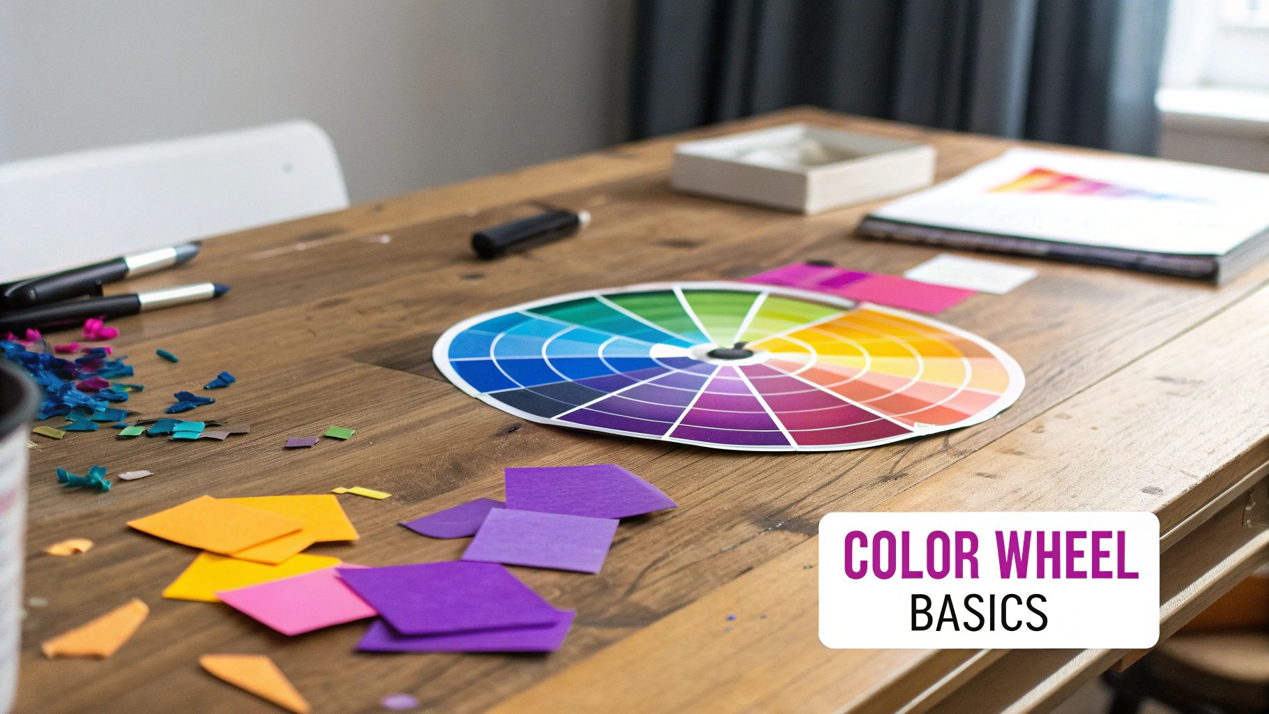
Think of the color wheel as your ultimate wardrobe cheat sheet. It’s not some complicated diagram meant only for artists—it's a straightforward, powerful tool that shows you exactly how colors relate to each other. Getting a handle on this wheel is the first real step in moving from random guesswork to creating intentional, stylish outfits.
At its heart, the color wheel is just a logical circle of colors, making it incredibly easy to see what works together. It’s all built on a foundation of just three key colors that you can't create by mixing others.
The Building Blocks: Primary Colors
Primary colors are the parents of every other color on the wheel. They are red, yellow, and blue. These are the pure, foundational hues that form the very basis of your entire wardrobe’s color palette.
Think of them as the most fundamental pieces you own: a classic red sweater, a vibrant yellow accessory, or a timeless pair of blue jeans. Everything else is simply born from a combination of these three.
The Next Level: Secondary Colors
When you mix any two primary colors, you create a secondary color. These are the friendly neighbors sitting right between the primaries on the color wheel. Simple as that.
- Orange: The result of mixing red and yellow.
- Green: What you get when you mix blue and yellow.
- Purple: Created by mixing blue and red.
These colors are just as common in our closets. A burnt orange jacket for fall, an olive green utility shirt, or a deep purple scarf are all perfect examples of secondary colors adding depth to what you wear.
Adding Nuance: Tertiary Colors
Finally, we have tertiary colors. You get these by mixing a primary color with the secondary color right next to it. Their names often give the game away, like blue-green (think teal or turquoise) or red-orange (like vermilion).
These in-between shades are what offer endless variety and sophistication to your style. They are the subtle teals, the rich maroons, and the warm chartreuses that make an outfit feel truly unique and polished. Understanding them opens up a whole new world of dressing.
How to Speak the Language of Color
Beyond just the color categories, there are three key terms that will help you master this clothing color matching guide. Don't worry, they're much simpler than they sound. Think of them as the settings you can adjust for any color.
1. Hue
This is the easy one. A hue is just the pure color itself—what we normally call "color," like red, blue, or green. It's the name of the color family.
2. Saturation
Saturation is all about the intensity or purity of a color. A highly saturated color is vibrant and bold, like a punchy neon green. A less saturated, or desaturated, color is more muted and subtle, like a soft sage green. It’s the difference between a bright, fire-engine red and a muted, dusty rose.
Think of saturation as a "vibrancy" dial. Turning it up makes a color pop, while turning it down makes it softer and more understated, almost as if you mixed it with a bit of gray.
3. Value
Value describes the lightness or darkness of a color. When you add white to a hue, you create a lighter value, known as a tint (like pastel pink). Add black, and you create a darker value, called a shade (like a deep maroon).
Imagine adjusting the brightness on your TV remote—that's exactly what value does for a color. This concept is the key to creating stunning monochromatic outfits, where you combine different values of the same hue for a cohesive, elegant look.
While it might seem complex, many shoppers already gravitate towards versatile basics. In fact, data analysis of over 70 million shopper reviews shows that black, white, and blue are the three most dominant colors in global fashion retail. Black is the top choice in markets like the US and UK, proving its unmatched versatility. You can find out more about the most popular fashion colors on Woven Insights.
Proven Formulas for Perfect Outfit Color Schemes
Now that you’ve got a handle on the color wheel, let’s get into the fun part: using it to build incredible outfits. Think of these color-matching formulas as trusted recipes. They’re not strict rules, but rather time-tested strategies for putting together combinations that just work.
Whether you’re aiming for sophisticated, energetic, or something in between, these schemes take the guesswork out of getting dressed. Learning them means you can intentionally craft a look that sends the exact message you want.
Mastering the Monochromatic Look
The monochromatic look is easily one of the most elegant and foolproof ways to style yourself. It’s all about building an outfit using different shades, tints, and tones from the very same color family. And no, it’s not boring—it’s the secret to a clean, elongated, and seriously polished silhouette.
Let's say your color is blue. A monochromatic outfit isn't about wearing head-to-toe royal blue. Instead, you might pair dark navy trousers with a light, sky-blue shirt and a classic denim jacket. Each piece is different, but they all harmonize beautifully, creating a look that’s both cohesive and calming.
The real trick to a killer monochromatic outfit? Play with textures. A chunky knit sweater paired with silk pants in the same color family adds a ton of depth and keeps the look from falling flat.
Creating Harmony with Analogous Colors
Want to wear color without causing a scene? The analogous color scheme is your new best friend. This approach uses colors that sit right next to each other on the color wheel. Think of them as cousins—they just naturally go together.
For example, you could easily combine yellow, yellow-green, and green. Picture olive green pants, a soft yellow top, and maybe a vibrant chartreuse scarf. Because these colors share common undertones, the final look is rich and interesting without being loud or jarring.
Analogous schemes are perfect for creating outfits that feel intentional and layered. They give you more variety than a monochromatic look while still feeling incredibly unified. It’s a fantastic technique for building seasonal palettes, like the warm reds, oranges, and yellows of an autumn day.
Making a Statement with Complementary Colors
When you’re ready to turn heads, it’s time to use complementary colors. These are the power couples of the color wheel—hues that sit directly opposite each other. When you put them together, their high contrast makes each color pop, creating a bold, dynamic statement.
The most classic complementary pairs are:
- Red and Green: Imagine a deep forest-green dress with a pop of red from a handbag.
- Blue and Orange: A sharp navy blazer over a burnt orange sweater is always a winner.
- Yellow and Purple: A soft lavender blouse with a pale yellow skirt feels instantly fresh and bright.
Because this combination is so strong, a good rule of thumb is the 70/30 rule. Let one color be the star of the show (about 70% of the outfit) and use its opposite as a powerful accent (the remaining 30%). This keeps the look from feeling overwhelming and makes the contrast feel chic and purposeful.
Before we move on, here’s a quick-reference guide to these classic color formulas.
Classic Color Matching Formulas
This table breaks down the most effective color schemes, what they communicate, and when to use them for maximum impact.
| Scheme Type | Description | Visual Effect | Best For |
|---|---|---|---|
| Monochromatic | Using tints and shades of a single color. | Elegant, sophisticated, and elongating. | Professional settings, minimalist looks, creating a seamless silhouette. |
| Analogous | Using 2-3 colors that sit next to each other on the color wheel. | Harmonious, calm, and visually interesting. | Everyday wear, seasonal outfits, creating a thoughtful, layered look. |
| Complementary | Using two colors that are directly opposite on the color wheel. | Bold, high-contrast, and energetic. | Making a statement, creative events, when you want to stand out. |
Keep this table handy as you experiment. It's a simple cheat sheet for mastering the art of color coordination.
This infographic breaks down which color families best match warm, cool, and neutral skin undertones.
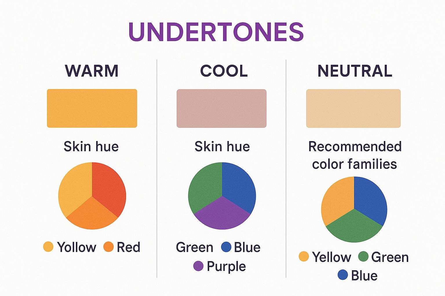
As you can see, matching your outfit's colors to your natural undertones is a simple way to make sure you always look your best.
How to Use Neutrals to Build a Smarter Wardrobe
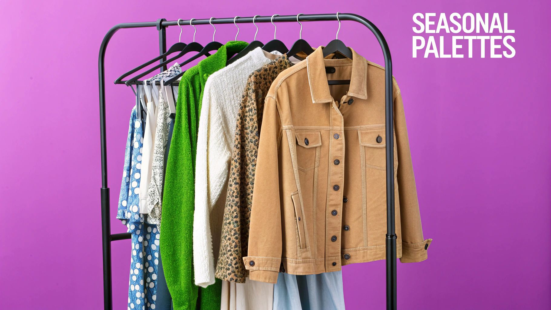
If you think of your wardrobe's vibrant pieces as the lead singers, then the neutrals are the world-class rhythm section holding everything together. It's easy to dismiss shades like black, white, gray, beige, and navy as "boring," but that's missing the point entirely. These colors are the quiet workhorses that bring balance, versatility, and an air of sophistication to everything you wear.
Think of your neutral items as the canvas for your style. That classic pair of black trousers or a simple white tee is what allows a bold, patterned blazer or a bright scarf to truly shine. Without that solid foundation, vibrant colors can quickly look chaotic or overwhelming. Building a strong core of neutrals gives you the freedom to experiment with bolder hues without ever worrying about a mismatch.
The Real Power of a Neutral Base
A well-curated collection of neutral pieces is the secret to a wardrobe that feels almost infinite. These items mix and match effortlessly, not just with each other but with nearly any other color you can imagine. This creates a reliable foundation that makes getting dressed in the morning so much easier and multiplies your outfit combinations.
This isn't just a theory—it’s how people actually dress. A 2022 survey of over 12,000 American consumers revealed that neutrals like black, white, and gray are the most frequently worn colors. This data really underscores why so many clothing color matching guides champion these hues as the backbone of a smart wardrobe. You can explore the apparel color scheme findings on Statista to see the full breakdown.
Introducing the 60-30-10 Rule
So, how do you put this into practice? One of the most effective tools I've come across is the 60-30-10 rule. It’s a simple, elegant framework borrowed from the world of interior design that translates beautifully to fashion. It’s essentially a foolproof recipe for creating outfits that feel balanced and visually interesting every single time.
The rule breaks down your outfit's color palette into three key roles:
- 60% The Dominant Color: This is your main event, the color that makes up the bulk of your outfit. To get the most mileage out of your wardrobe, this is almost always a neutral—think of a navy suit, a gray dress, or a classic beige trench coat.
- 30% The Secondary Color: This color is there to support the main one and add a bit more depth. It could be another neutral or a more toned-down color. For example, if your dominant color is that gray suit, your secondary color would be a white button-down shirt.
- 10% The Accent Color: This is where you get to have some fun. The accent is that small pop of a bold or bright color that gives the outfit its personality. It might be a vibrant tie, a colorful handbag, or a pair of statement shoes.
The 60-30-10 rule is your secret weapon for visual harmony. It stops any one color from stealing the show, ensuring your outfit looks intentional and polished, not accidental.
This simple structure gives you a clear roadmap for putting together a look. It takes the guesswork out of the equation and helps you understand why some combinations just feel right.
Putting the Rule into Practice
Let's walk through a real-world example. Imagine you're putting together a smart-casual outfit that you want to feel both timeless and modern.
- Start with 60% Dominant Neutral: You grab your favorite pair of well-fitting dark gray trousers. This piece anchors the entire look and sets a sophisticated tone.
- Add 30% Secondary Color: Next up is a crisp white shirt. White is also a neutral, but here it provides a clean, contrasting layer that complements the gray perfectly without competing for attention.
- Finish with 10% Accent Pop: Now for the final touch—the personality. You could add a rich burgundy belt and a matching pair of loafers. That small splash of deep red adds warmth and a focal point, instantly elevating the entire outfit from simple to seriously stylish.
This method isn’t about rigidly following a formula; it’s about creating a system that puts you in control. Once you master the art of using neutrals and start applying the 60-30-10 rule, you unlock a new level of confidence in your personal style, making every outfit a deliberate choice.
Choosing Colors That Flatter Your Skin Tone
Beyond the color wheel, the most powerful tool for picking clothes is your own skin. The right colors can make you look vibrant and energized, while the wrong ones can make you seem tired or washed out. This isn't just a matter of taste; it's about the subtle science of how light reflects off your skin's unique undertones.
Learning your personal palette is the secret to building a wardrobe that just works. When your clothes harmonize with your natural coloring, you get an effortless glow. This knowledge helps you shop smarter, build cohesive outfits, and finally understand why some shades feel amazing while others just fall flat.
Discovering Your Skin's Undertone
Your skin’s undertone is the subtle hue just beneath the surface. It’s different from your overt skin tone (like fair, medium, or deep) and doesn't change when you get a tan. There are three main undertones: cool, warm, and neutral. Finding yours is surprisingly easy with a few simple at-home checks.
One of the most reliable ways is the vein test. Just look at the veins on the inside of your wrist in natural daylight.
- Cool Undertone: Your veins appear mostly blue or purple.
- Warm Undertone: Your veins look more greenish or olive.
- Neutral Undertone: It’s hard to tell, or you see a mix of both blue and green.
This quick glance is your first real step toward unlocking a color strategy that’s tailored to you.
Building Your Cool-Toned Palette
If you have cool undertones, your skin has subtle hints of pink, red, or blue. You'll look your absolute best in colors that share this cool foundation because they’ll complement your natural coloring instead of clashing with it. Think of colors inspired by the ocean or a crisp winter day.
Your power colors are all on the cool side of the spectrum. Rich blues, deep purples, and vibrant jewel tones will make your skin pop.
Best Colors for Cool Undertones:
- Blues: Everything from bright cobalt and royal blue to icy pastels.
- Pinks: Think shocking pink, fuchsia, and soft rose.
- Greens: Emerald green and deep teals are fantastic.
- Reds: Stick to blue-based reds, like cherry or a true ruby.
- Neutrals: Crisp white, cool grays, and deep navy should be your go-to basics.
Leaning into these shades creates a natural harmony between your clothes and your skin. The result is a brighter, more radiant appearance without any extra effort.
Curating Your Warm-Toned Wardrobe
For those with warm undertones, your skin has a golden, peachy, or yellow cast. You'll shine brightest in colors that echo this natural warmth—picture earthy tones and sunny, autumnal shades. These colors will bring out your skin’s inherent glow.
Your ideal palette is packed with rich, sun-kissed hues. You'll want to steer clear of icy tones, which can make your skin look a bit dull, and instead embrace colors that feel vibrant and organic.
Best Colors for Warm Undertones:
- Reds: Go for orange-based reds like coral, terracotta, and brick.
- Yellows & Oranges: Mustard yellow, gold, and burnt orange are incredibly flattering.
- Greens: Earthy greens like olive, moss, and jade are perfect.
- Neutrals: Reach for creamy off-whites, camel, chocolate brown, and warm beige.
These shades will amplify the natural warmth in your complexion, making you look healthy and luminous.
The Advantage of a Neutral Palette
If you landed in the neutral category, congratulations—you have the most versatility of all. A neutral undertone means you have a nice balance of cool and warm tones. This gives you the unique freedom to wear colors from almost the entire color wheel without risking a major clash.
While most colors look good on you, you'll find you look best in shades that aren't overly saturated. Extremely bright or neon colors can sometimes overpower your balanced complexion. Instead, try softened or muted versions of colors from both palettes—think dusty rose instead of magenta, or jade green instead of electric lime. Your best neutrals are colors like light gray, off-white, and mid-range blues.
Got Color Questions? We've Got Answers.
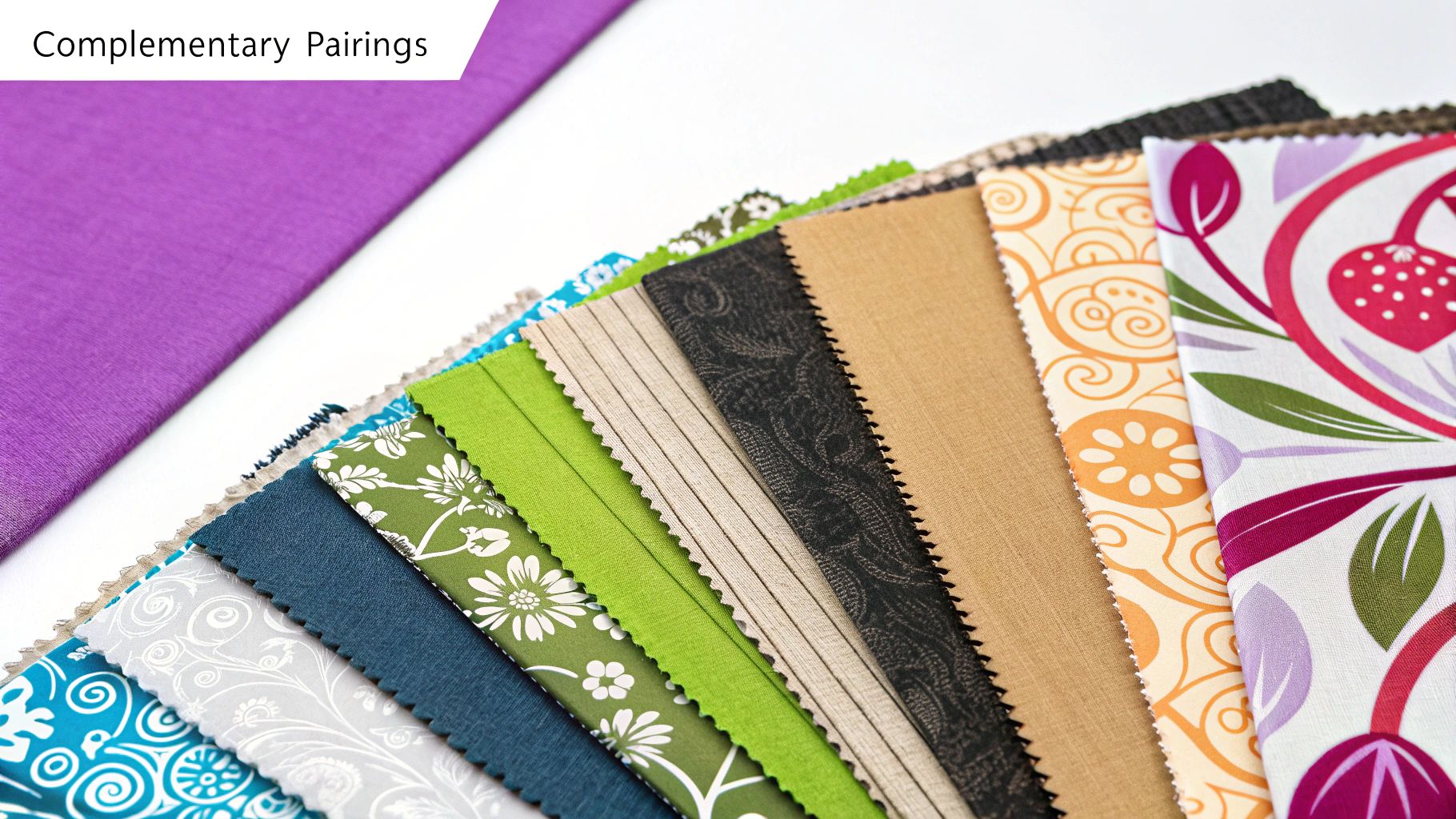
Even after you get the hang of the color wheel, putting it all into practice can bring up some tricky situations. This is where we tackle those real-world styling questions—the ones you ask yourself while standing in front of your closet.
Think of this as your personal style helpline. We’re here to give you clear, straightforward answers to the most common color-pairing dilemmas.
Can You Really Wear Black with Brown or Navy?
This is one of the oldest, most stubborn style myths out there, and the answer is a confident yes. The trick isn't to avoid pairing these deep neutrals; it's to make the combination look intentional and sophisticated. The old "rule" came from a fear of looking like you got dressed in the dark, but today, this combo is pure class.
When you mix black and brown, make sure the shades are different enough to create a clear contrast. A pair of rich, chocolate brown boots with crisp black trousers? That looks sharp and deliberate, not accidental.
The same goes for black and navy. It works beautifully when you play with different textures or finishes, like a sleek black leather jacket layered over a cozy navy knit sweater. This adds visual depth and proves that these classic colors belong together.
How Do You Mix Patterns Without Looking a Mess?
Diving into pattern mixing can feel a little chaotic, but a couple of simple guidelines make it incredibly fun and stylish. The whole secret is to find a common thread that ties the prints together. This is what creates harmony instead of clashing.
Here are a few ways to mix patterns like a pro:
- Find a Common Color: This is the easiest trick in the book. If you want to pair stripes and florals, just make sure they share at least one color. A blue-and-white striped top with a floral skirt that has hints of that same blue will look instantly put-together.
- Play with Scale: Combine a big, bold pattern with something smaller and more subtle. For example, try a wide-striped blazer with a blouse that has a tiny polka-dot print. The difference in scale lets one pattern take the lead while the other acts as a supporting texture.
- Treat Some Patterns as Neutrals: You might not think of them this way, but classic patterns like thin pinstripes, leopard print, or small polka dots can absolutely function as neutrals. They’re understated enough to pair with something much louder without creating a visual overload.
The goal isn't to find a perfect match but to create a visual conversation between your pieces. By focusing on shared colors and different scales, you can build dynamic outfits that feel uniquely you.
How Many Colors Is Too Many in One Outfit?
That old "no more than three colors" rule is a solid starting point for beginners, but it's by no means a strict law. It’s much more useful to think in terms of balance and purpose, like with the 60-30-10 principle we touched on earlier. You can definitely wear more than three colors, especially when neutrals or patterns are in the mix.
A well-styled, multi-colored outfit almost always has a clear dominant color that anchors the entire look. The other shades should act as accents, adding pops of personality without making things feel cluttered. The global market for textile colorants, valued at USD 10.21 billion in 2023, is always expanding our options with new dyes, allowing for far more sophisticated palettes in fashion. As new possibilities emerge, those old, rigid rules become less relevant. You can discover more insights about textile colorant market trends on fortunebusinessinsights.com.
At the end of the day, if an outfit feels balanced and you feel great wearing it, you've nailed it. Confidence is always the best measure.
Feeling overwhelmed by all the choices? Let technology take the guesswork out of getting dressed. AI Fashion Stylist analyzes your clothes, suggests flawless color pairings, and helps you build a wardrobe where every piece works together. Just upload a photo to get instant, personalized style advice. Try AI Fashion Stylist and get dressed with confidence today.
Article created using Outrank
