Uncategorized
How to Match Clothes Colors and Style Outfits
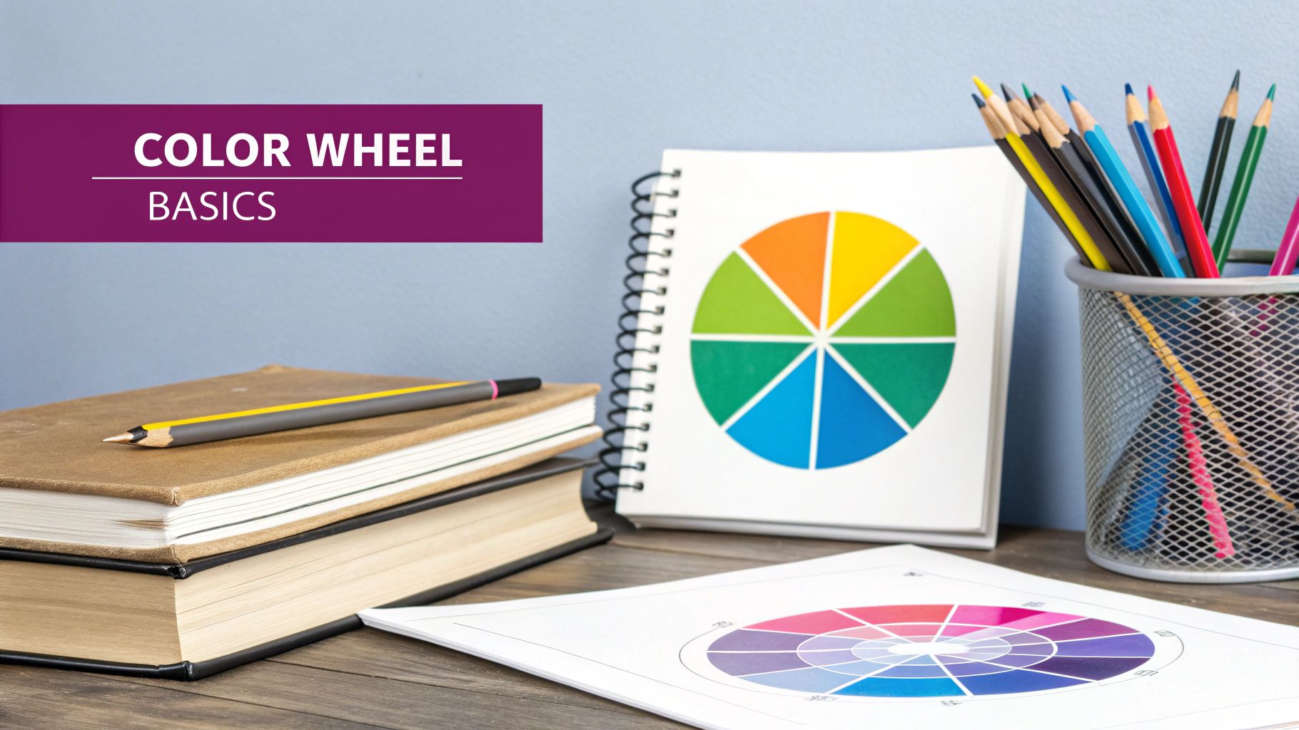
Matching your clothes really comes down to one simple tool: the color wheel. Think of it as your secret map for figuring out which colors look great together. It's how you can create outfits that feel harmonious and stylish, whether you're using complementary, analogous, or even monochromatic color schemes.
Why Understanding Color Is Your Style Secret
Have you ever stared into a closet packed with clothes, yet felt like you had nothing to wear? The problem usually isn't a lack of options—it's not knowing how to pair them. This is where a little bit of color theory, especially the color wheel, becomes your best friend in fashion. It’s the behind-the-scenes secret that stylists use to build outfits that just click.
This isn't some abstract concept from art class; it's a practical guide for your everyday wardrobe. Once you get the hang of the color wheel, you have a solid framework for making confident styling decisions. It explains the "why" behind certain combinations—why some pairings feel bold and full of energy, while others look polished and sophisticated.
Let’s break down what this knowledge can do for you:
- No More Guesswork: It gives you simple, proven formulas for pairing colors, so you can stop just winging it.
- Unlock Your Closet's Potential: You'll start seeing new outfit possibilities with the clothes you already have.
- Boost Your Confidence: When you understand why certain colors work together, you feel more intentional and put-together in your style choices.
The Power of the Color Wheel
So, what is this magic tool? The color wheel is just a circular chart that illustrates the relationships between colors—primary, secondary, and tertiary. It’s a visual cheat sheet that helps you predict how different hues will look when you put them side-by-side.
It clearly shows how primary colors like red, yellow, and blue mix to create secondary colors like green, orange, and purple.

This simple diagram organizes colors based on their relationships, making it incredibly easy to spot pairings that work, like those sitting directly opposite each other.
The big takeaway is that colors have predictable relationships. Once you understand them, you can build outfits that look balanced and deliberate, not just thrown together. It’s less about following rigid rules and more about knowing what kind of vibe different combinations will create.
The principles of the color wheel, first mapped out by Sir Isaac Newton, are still fundamental today. In fact, modern research into consumer preferences has shown that approximately 60-70% of people view outfits using complementary colors as more attractive and visually pleasing. You can learn more about the impact of color in textiles to see just how deep this goes.
Build Outfits with Core Color Schemes
Knowing the color wheel is one thing, but actually using it to get dressed? That's where the real magic happens. Let's move past the abstract theory and into the practical, day-to-day color formulas that professional stylists swear by. Getting a handle on these simple schemes is honestly the fastest way to start matching your clothes with confidence.
Think of these less as rigid rules and more as proven recipes for creating a specific mood. Once you understand a few key combinations, you can intentionally build outfits that feel bold, harmonious, or effortlessly sophisticated.
Go Bold with Complementary Colors
Ready to turn some heads? Complementary colors are your best friend. These are simply pairs that sit directly opposite each other on the color wheel—think blue and orange, red and green, or yellow and purple. This high-contrast pairing creates a vibrant, eye-catching look that just buzzes with energy.
Since this combination makes such a strong statement, it works best when one color takes the lead and the other acts as a powerful accent. For instance, you could ground your outfit with a classic navy blue blazer and then add a pop of burnt orange in your top or handbag. The key is all about balance; you definitely don't need a 50/50 split.
A complementary scheme is your go-to for making a statement. It’s perfect when you want your outfit to have a focal point that draws attention in a stylish, deliberate way.
Create Harmony with Analogous Colors
If you're after a more subtle, cohesive vibe, an analogous color scheme is probably your perfect match. This method is all about pairing colors that are neighbors on the color wheel, like blue, blue-green, and green.
The result is a beautifully blended, low-contrast effect that feels serene and polished. Imagine an outfit with olive green pants, a teal top, and a forest green jacket. Because the colors are so closely related, you get this rich, layered look that feels coordinated without even trying. It’s a fantastic way to play with multiple colors without ever worrying about them clashing.
Achieve Sophistication with a Monochromatic Palette
A monochromatic outfit uses various tints, tones, and shades of a single color. This is the secret to looking incredibly chic and put-together with minimal effort. But let's be clear: this doesn't mean wearing the exact same shade from head to toe.
Instead, you’re layering different variations. Think light-wash blue jeans with a chambray shirt and a deep navy cardigan. The real trick to making a monochromatic look feel dynamic is to play with texture. Try pairing a chunky cream knit sweater with smooth beige trousers and some off-white leather sneakers. The mix of textures adds visual depth and keeps the outfit from falling flat.
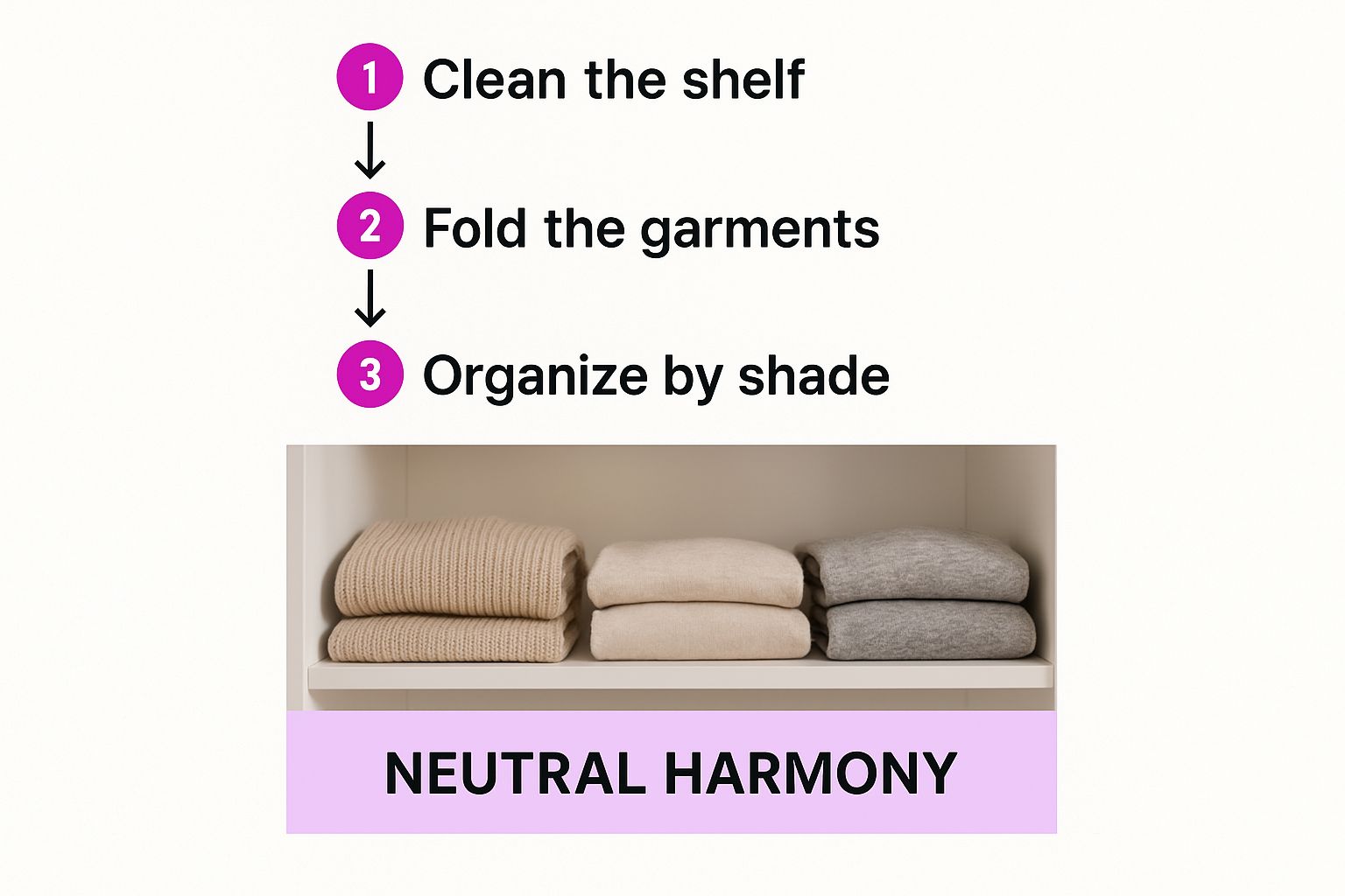
This image here does a great job of showing how versatile neutrals are as a base for any of these color schemes.

As you can see, having a solid foundation of neutral basics makes it so much easier to introduce those complementary, analogous, or monochromatic pops of color.
To make this even easier, I've put together a quick cheat sheet. Keep this handy next time you're staring into your closet and feeling uninspired.
Your Cheat Sheet to Outfit Color Schemes
| Color Scheme | What It Is | The Vibe It Creates | Easy Outfit Idea |
|---|---|---|---|
| Complementary | Colors opposite each other on the color wheel. | Bold, energetic, and eye-catching. | Navy blue trousers with a burnt orange sweater. |
| Analogous | Colors next to each other on the color wheel. | Harmonious, serene, and sophisticated. | Olive green pants, a teal top, and a forest green scarf. |
| Monochromatic | Different shades and tints of a single color. | Chic, elongating, and effortlessly polished. | Light gray t-shirt, charcoal jeans, and a dove gray jacket. |
With these three simple approaches in your back pocket, you have a reliable framework for building stylish, intentional outfits every single day.
Using Neutrals as Your Wardrobe Foundation
Let's talk about the real workhorses of your closet: the neutrals. I'm talking about black, white, navy, beige, and all the shades of grey. These aren't just boring background colors; they are the bedrock of every single well-put-together outfit. If you really want to master matching clothes, you don’t start with a rainbow of brights. You start here.
Building your core wardrobe around a solid set of neutrals is the smartest style move you can make. It takes the guesswork out of getting dressed. These shades play well with each other and, crucially, they let you introduce bolder colors without ever looking like you tried too hard.
The Power of a Neutral Base
Think about it: starting with a neutral piece is the easiest way to guarantee your outfit will look cohesive. An all-neutral look can be incredibly chic all on its own, especially when you start mixing up textures. This is what we call tonal dressing.
Imagine layering different shades from the same neutral family—a cream-colored cashmere sweater with some tan wide-leg trousers and maybe some off-white boots. It’s subtle, but it has so much depth and visual interest without screaming for attention. Honestly, it's my go-to trick for looking polished with minimal effort.
Introducing Pops of Color with the 60-30-10 Rule
Okay, so you've got your neutral base down. Now for the fun part: adding color. A great little hack for this comes from the world of interior design, and it’s called the 60-30-10 rule. It’s a simple ratio that keeps your color palette feeling balanced and intentional.
Here's how you can break it down for your outfits:
- 60% is your primary neutral. This is the main event. It could be a navy suit, a classic black dress, or even just your favorite grey jeans and a matching jacket.
- 30% is your secondary color. This is the supporting act, a color that complements your main neutral. Think of a crisp white shirt under that navy suit or a soft blue blouse paired with the grey jeans.
- 10% is your accent color. This is where you make a statement. It’s that small, vibrant detail that pulls everything together and gives the outfit personality.
Let’s walk through a real-world example. Picture an outfit that’s mostly charcoal grey (60%) with a simple white top (30%). It's a solid, classic look. But now, add a pop of color with a bright magenta scarf or a bold yellow handbag as your 10% accent. Suddenly, the entire outfit goes from safe to seriously stylish.
This rule isn't about rigid math; it's a guide to help you experiment. It gives you a framework to ensure your pop of color enhances your look instead of completely taking it over.
Going Beyond the Basics: Advanced Color Matching
Once you've got the hang of the core color schemes, it's time to really start having fun and developing a signature look. This is where we move past the basic rules and learn how to put colors together in a way that’s genuinely you. It’s all about playing with the subtleties of color temperature and texture.
One of the best ways to instantly elevate an outfit is to think about a color's warmth or coolness. Warm colors have that sunny, golden vibe—think terracotta, mustard yellow, and olive green. On the other side, cool colors have a crisp, bluish undertone, like sapphire blue, emerald green, or a deep magenta.
When you pair colors that share the same temperature, the result is incredibly cohesive. For example, a warm rust-colored sweater with some khaki trousers just feels right. In the same way, a cool-toned lavender top with a charcoal grey skirt creates a really sophisticated and unified look. It’s an easy trick that makes your outfits look thoughtfully put together.
Find the Hues That Make You Shine
This whole idea of color temperature isn't just for your clothes; it applies to you, too. The secret to finding the colors that make you look amazing is understanding your skin's undertone—whether it’s warm, cool, or neutral.
Not sure what you are? Here's a quick trick: look at the veins on the inside of your wrist. If they look a bit greenish, you probably have warm undertones. If they appear more blue or purple, you're likely in the cool-toned camp.
- Warm Undertones: You'll absolutely glow in earthy colors. Think cream, camel, olive green, and burnt orange.
- Cool Undertones: Your go-to shades will be jewel tones. Royal blue, ruby red, and emerald green will look fantastic on you, as will crisp whites and greys.
The point isn't to limit what you can wear. It's about finding the version of each color that flatters you most. Anyone can wear red, for instance. But if you have cool undertones, you'll look incredible in a blue-based cherry red. If you're warm-toned, a fiery, orange-based red will make you pop.
The Art of Mixing Prints and Textures
Great style isn't just about solid colors; it's also about how you play with patterns and fabrics. If you've ever been nervous about mixing prints, the secret is finding a common color to tie everything together. A classic navy-and-white striped shirt looks fantastic with a floral skirt that has just a little bit of navy blue in the pattern. That shared color makes the whole look feel intentional, not chaotic.
Texture works the same way, adding incredible depth and interest, especially to a single-color outfit. An all-black ensemble goes from simple to stunning when you combine different materials. Imagine a silk cami, leather pants, and a wool coat. Each fabric catches the light differently, creating subtle contrast that’s so much more compelling than just a wall of one texture.
This kind of detail is what takes an outfit from good to great. It's such a crucial element that the fashion industry is now using technology to get it right. AI-based tools are helping brands ensure color consistency, which has helped slash online apparel returns from color mismatches—an issue that once accounted for a whopping 20-30% of all returns. You can discover more about material color matching technology and see how it's changing the retail game.
How AI Is Solving Your Color Matching Problems
Let's be honest, technology has quietly crept into our wardrobes, changing how we shop for and match clothes. At the heart of this shift is Artificial Intelligence (AI), which is tackling one of the most frustrating parts of online shopping: figuring out what color you're actually buying.

We've all been there. You're searching for a specific shade of green, and you're hit with a dozen different, flowery names like ‘seafoam,’ ‘mint,’ and ‘pistachio.’ What's the real difference? It’s a guessing game. AI is cutting through that confusion by analyzing huge collections of fashion data to group these creative names into standardized, understandable color categories.
The goal is simple: make sure the color you see on your screen is the one that shows up at your door. This has a huge impact, not just for us as shoppers, but also for retailers who see a major drop in returns. It’s a genuine step forward in making our online styling decisions a whole lot easier.
You can think of AI as a universal translator for color. It ignores the marketing fluff and gives you a much clearer idea of what you’re buying, simplifying the whole process of matching clothes.
The most impressive part? This color normalization happens almost instantly. A task that used to take teams weeks of manual data entry can now be done in minutes, sorting out whether something is 'navy blue' or 'dark blue' across thousands of different products. If you're curious about the tech behind it, you can learn more about AI-powered fashion intelligence and see how it all works.
A Few Common Color Questions, Answered
Even when you know the rules, some color combinations can still feel a little daunting. Let's tackle some of the most common questions that come up when you're standing in front of your closet.
Can You Really Wear Black and Brown Together?
Absolutely. That old "rule" about not mixing black and brown is completely outdated. The trick to making this combination look chic and intentional is all about creating enough contrast. Think about pairing a rich, chocolate brown with a true, deep black—it looks fantastic.
Another pro tip? Play with textures. A brown leather jacket with black jeans, for instance, or a black silk cami with brown corduroy trousers. The mix of materials adds a ton of visual depth and proves you put thought into the look.
How Many Colors Is Too Many in One Outfit?
When in doubt, stick to the rule of three. Keeping your main color palette to just three colors is a surefire way to look cohesive and put-together, rather than chaotic.
This is where the 60-30-10 principle we talked about earlier really shines. Your main color takes up about 60% of the look, your secondary color about 30%, and a fun accent color takes the final 10%. It’s a simple formula that keeps your outfit feeling perfectly balanced.
Ready to take the guesswork out of getting dressed? The AI Fashion Stylist app gives you instant, personalized advice on color pairings and complete outfits. Get actionable feedback and look your best every day. Download it for free at https://magicmirrorai.app and discover a smarter way to style.
